
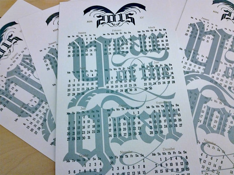
Letterpress “Year of the Goat” Calendar
Being a small letterpress shop, we are obliged to send out an annual holiday card to our clients and friends. For a few years, we did silly graphics of our face in festive green and red colors, but this year’s business picked up so quickly that we realized that printing and getting our own cards out by December 25th would be nearly impossible.

As soon as we realized there was no way to get our own cards out in time, we quickly pivoted to a new years theme. Given that 2015 is the year of the goat, and that goats are a classic heavy metal motif, we thought we’d jump at the opportunity to do a large calendar using blackletter typography.
Our paper of choice for this print was Neenah’s Wild card stock. (new recommendation is Savoy) We chose a 166lb weight to help create a “bite” impression in the print and a legal size cut so that the finished product would stand out amongst the many mail pieces our friend receive during the holidays.

The first step in our process was to create a photopolymer plate of the images that we intended to transfer to the paper. This photopolymer plate was then transferred to a metal base that raises the plate to “type high,” the height which wood and metal type was originally placed onto the vintage press.

After the image was set into position, we began printing the first color. We had initially inked up the press with a gold ink, but changed our minds after the fifth or sixth print. We kept a few to give of the golden stylized typography for posterity before switching to a lighter, metallic silver.

Black ink was used as a second color for the “2015” headline, stylized into the shape of a goat’s head, followed by gold ink for the months and roman numerals in the headline.

Despite it’s name, SF Letterpress is relief print shop in Oakland, California run by boyfriends Shaun Osburn and Michael Vilayvong. They specialize in gig posters, album covers and curate their own line of sometimes inappropriate stationary.

That was fascinating. Before you were born, I worked at a School District and my boss ran the presses, and I did the design, but nothing so fancy. Really love it and am amazed you are making a wonderful living at it. Not amazed that you are good, but maybe I wished I had preserved. But maintaining a press might have been way too big a step for me back then. Now, it still might be pushing it. They are so much more complicated than they look and they look complicated. I think he let me clean the rollers 🙂 LOL