A Guide to Additive and Subtractive Colors
Colors play a significant role in crafting art or design and visually communicating ideas. Whether you’re a graphics specialist, a paparazzo, or anyone interested in visual media, getting into the basics of color theory is crucial. Here are the two models of color mixing that are the cornerstone of digital designing: additive and subtractive color modes.
These two models govern how colors are created, blended, perceived, and deployed across various mediums. In this blog, we will demystify the difference between additive color and subtractive color, comprehensively demystifying their principles and practical applications.
What is Additive Color?
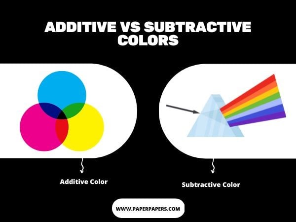
Additive colors involve combining different light sources to create all colors of the visible spectrum. The primary colors in additive color mixing are red, green, and blue (RGB). When these colors are combined at full intensity, they produce white light. Actually, the additive colors begin from black, but as the red, green, and blue add up, they change to white.
Varying the intensity of each primary color can produce a wide range of secondary hues and brightness levels. It’s the process employed in electronic displays such as TVs, computer monitors, smartphones, and other digital devices.
What is a Subtractive Color?
This color model entails the mixing of pigments to create colors employing reflected lights. When it comes to opting for colorants, you can utilize dyes, inks, or paints.
The subtractive color model uses cyan, magenta, yellow, and black (CMYK) as the primary colors. When these colors are printed on paper, they absorb all light and appear black.
It means that your eyes would receive no color, and you see darker results. Black is added to the CMY color model to improve shadow detail and text legibility in print.
Subtractive color mixing is used in printing processes, painting, or silk-screening, where inks are applied to paper or other substrates. Books, magazines, and printed materials deploy this type of color mixing. By overlapping translucent layers of ink, you can create a range of hues on the paper.
Subtractive and Additive Color
Understanding the contrast between additive and subtractive colors is significant for graphic enthusiasts in designing their models. It’s significant to choose the right color mixing model at the start of your project to acquire your desired outcomes.
Color Mixing Process
One of the basic comparisons between additive and subtractive colors is their process of color synthesis. Additive colors are represented by combining different intensities of primary colors. This color mixing model deploys transmitted light, and the addition of more colors results in brighter results.

On the other hand, subtractive color mixing involves filtering out the primary light color from white light, and hues are produced by selective absorption of certain light wavelengths. Unlike additive color models, the more colors are added, the duller or darker the result becomes. They appear muted in contrast.
Applications
The additive and subtractive colors are used in different applications for distinct purposes. From laptops and mobile phones to smartwatches, all electronic displays deploy additive color models.
On the other hand, subtractive colors are mostly used in physical art forms. For example, this color model is significant for painting, printing, and visuals on your magazines or flyers.
Systems involved in Additive and Subtractive Colors
RGB is a system of additive hues. On the digital device, the electrical charges activate red, green, or blue elements and cause them to glow. In this way, the desired hue is generated in one pixel by combining these three hues. The pixels are like tiny mosaics to create a picture. The unit for the measurement of digital graphics is PPI (Pixels per inch)
In contrast, CMYK is the system of subtractive color models. On the piece of paper, the print head in tints distributes cyan, magenta, yellow, and black colorants. Tint is a screen of tiny dots, each representing a percentage of one color.
When these dots overlap, the illusion of the hue is generated. So, in order to create the picture, various tints are then printed in overlapping patterns. The unit of measurement for a print graphic is DPI (Dots per Inch).

Conclusion
In short, acknowledging the ins and outs of additive and subtractive colors is essential for ensuring accurate representation and visual communication. Suppose you want to enhance the quality of your printing process.
For that, papers produced by PaperPapers act as a perfect canvas for accurate color display. We are a leading provider of a variety of papers that facilitate the precise showcasing of the final result. So, why wait? Order now and take your creativity to the next level.